Content design

Summary
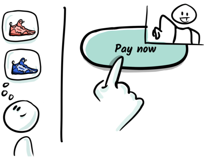
I wholesale revamped Shopify's checkout content. This case study focuses specifically on a new call-to-action that’s now ubiquitous in ecommerce.
Situation
The primary Call to Action (CTA) on the final step of checkout was unclear, and failed accessibility guidelines.
Hypothesis
Unclear content on the CTA was causing buyers to hesitate or abandon their purchases.
Problem for Shopify
Increased potential for abandoned purchases.
Problem for users
Reduced trust in the checkout and increased friction.

Approach
Validate hypothesis
Explore content options
Test

Solution
Meets accessibility standards
Clear
Consistent and familiar

Impact
Conversion improvements of $40+ million per year
Inclusive and accessible tone and voice
400 milliseconds faster per checkout
Unified Shopify ecosystem
Normalized data-driven content