Design systems

Summary
I led the creation of a new design system for Shopify's checkout. It's public-facing and has 1000s of users.

Situation
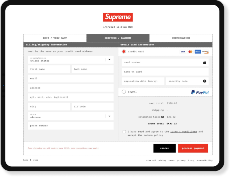
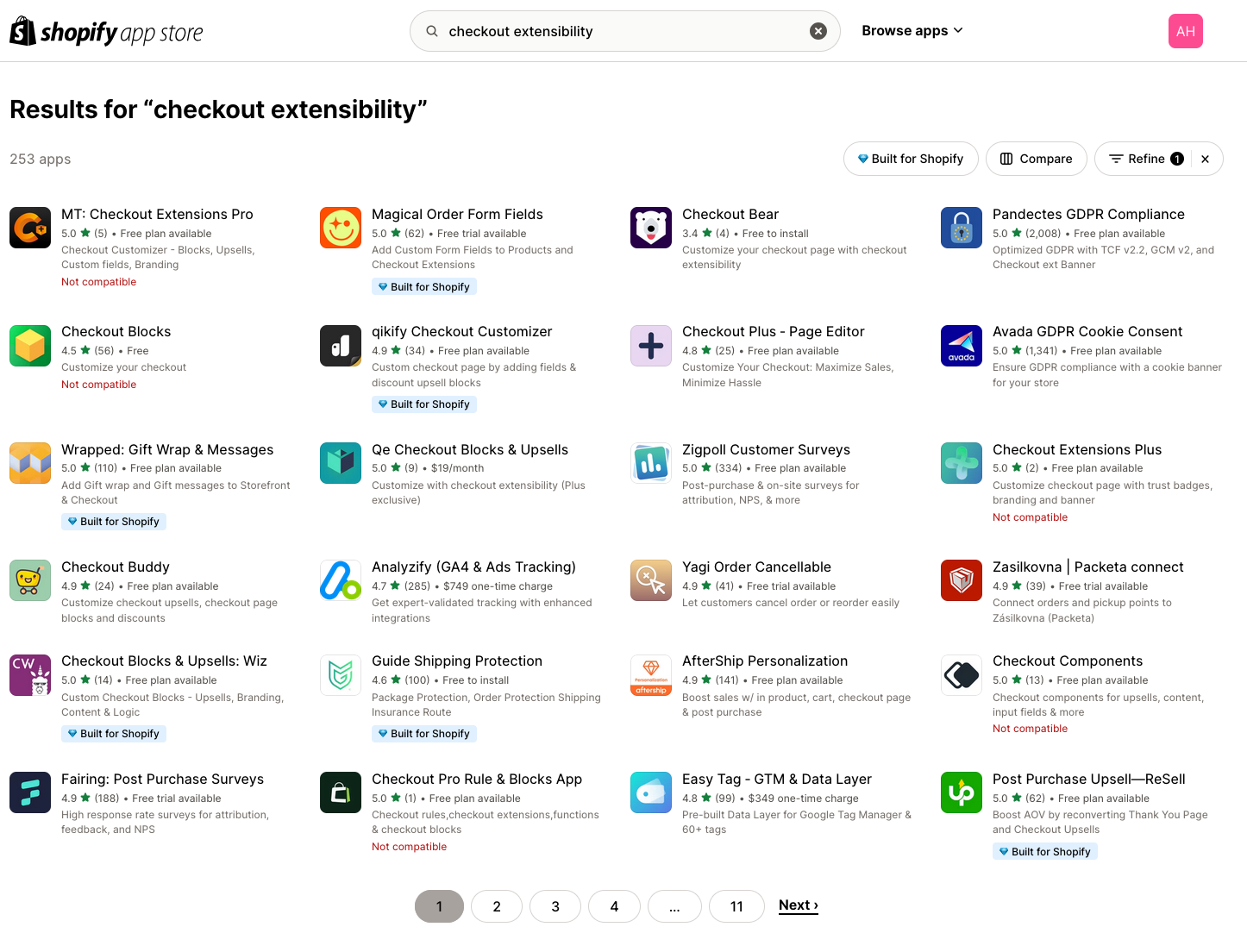
Shopify was relaunching checkout as a platform, enabling partners to build and launch apps on checkout.
Problem for Shopify
There was no way to ensure apps adhered to usability, accessibility, and other compliance needs.
Problem for users
Partners needed help to build apps, merchants needed apps that were a seamless part of their checkout.

Approach
REALLY understand merchant customization needs
Diverge from Shopify Polaris design system
Enforce accessibility and compliance

Solution
A decentralized design system that includes
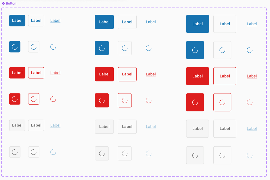
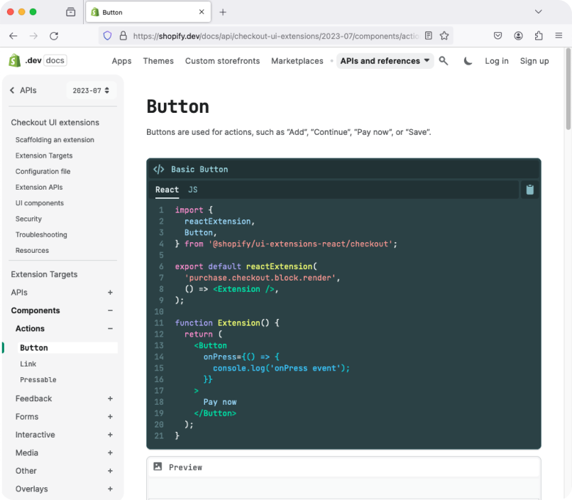
Components
UX guidelines
Figma UI Kit

Impact
100s of apps using the design system components
Components automatically reflect a store's branding
Apps are accessible and compliant by default
Design system extended to other Shopify surfaces